Flatss is an application designed to share and search for roommates. Unlike other similar marketplaces, Flatss incorporates a video presentation feature to connect users with similar interests and characteristics, thus facilitating contact between tenants and room owners.
2016 - 2017
UI design
Felix A Castillo
Pen & Paper
Sketch
It is often difficult to find a roommate in Berlin. The search for the right person can be tedious, with thousands of visits, calls and hours of surfing the Internet. However, Flatss offers a solution to this problem. With this app, you can create a video presentation and upload it to your profile. From there, the app takes care of the hard work of searching and linking your profile to the right one for you.
My goal was to improve the interface and interaction of the application. For example, modernizing new components such as buttons, icons, save search functions, etc. In addition, there were many other aspects to consider. My target audience was students, single people and those looking for short-term rentals. I focused on creating a fluid and simple design that would be easy for users to use.
My proposal included two distinct user flows: one to save searches and review them at a later time, and another to receive notifications about available rooms. In addition, I suggest the possibility of sending videos directly to people, without having to wait for the application to automatically make the connection.
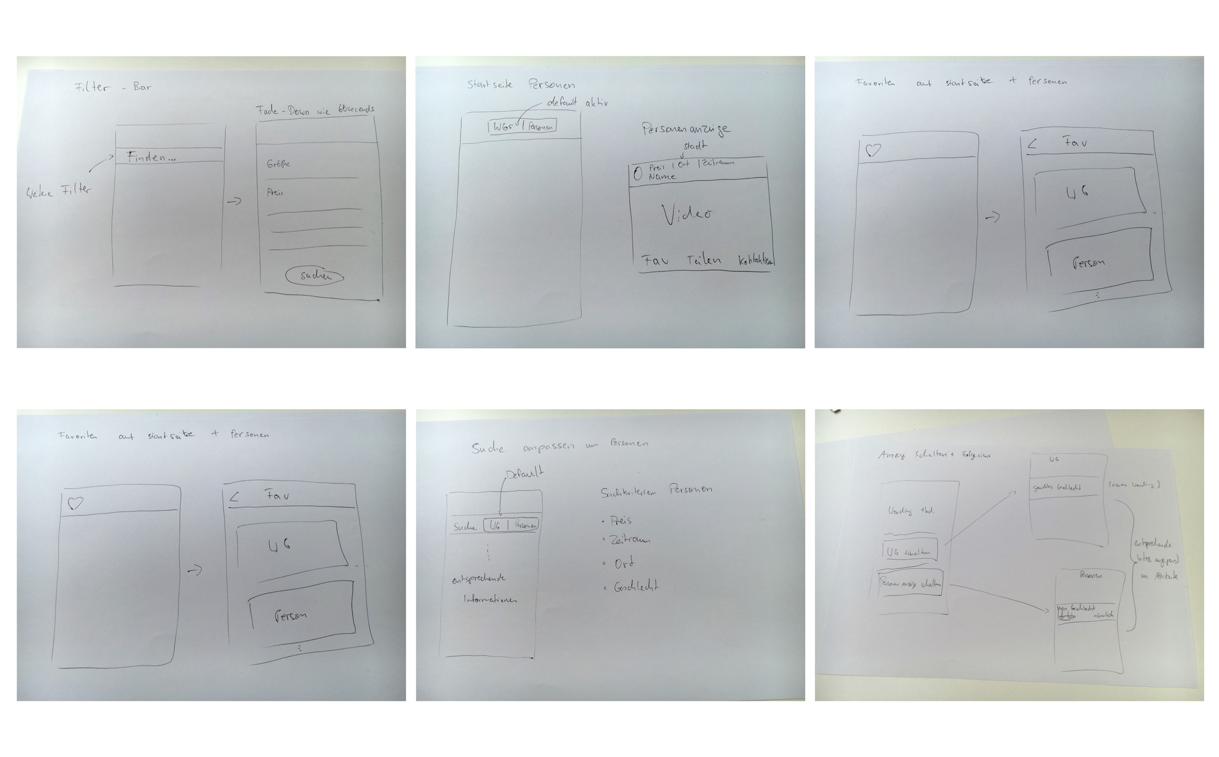
As I entered the ideation phase, I took into account everything I had gathered so far: the people, their weaknesses and the new flows I had proposed. I started to visualize things by sketching out rough concepts.

Followed by the first designs on paper, the first low-fidelity sketches.

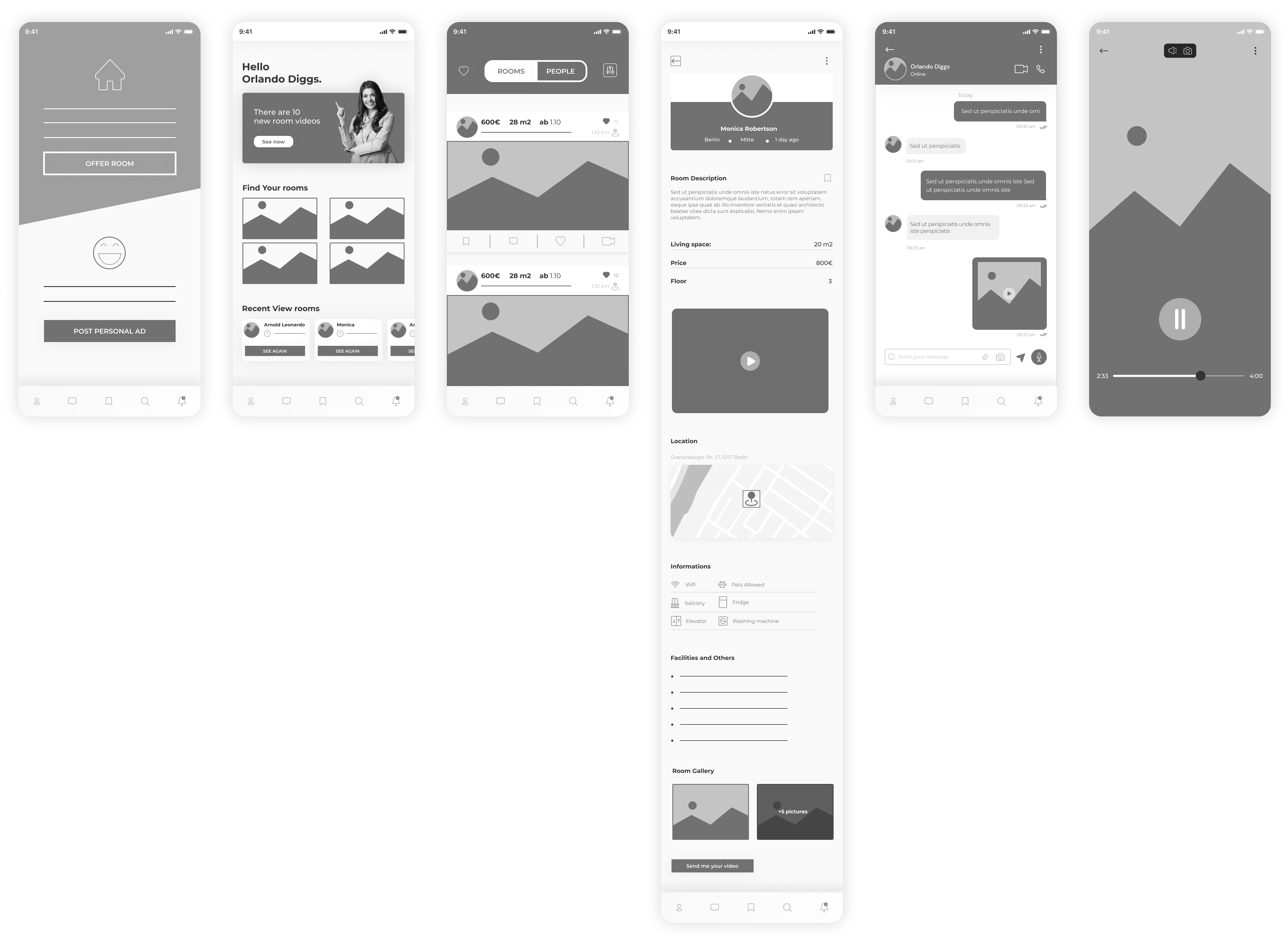
At this stage, which I consider one of my strengths, I focused on visualization and how the interface and interaction could enhance the main functionalities. In addition, I challenged myself by designing with both iPhone and Samsung devices in mind.
One of the most common actions observed in the top menu during evaluations was that users were constantly selecting options with one hand while holding the phone with the other.
Therefore, my original design was not very compatible, as it required multiple edits to both the bottom and top menus due to the difficulty of one-handed access. To address this problem, I opted to combine both menus into one menu located at the bottom of the screen.
This is not a perfect solution, either, as the iPhone X's home bar is also located at the bottom. Therefore, I had to pay special attention to the space between the tab touch area and the home bar to ensure an optimal user experience.